Nodoku Components README
https://github.com/nodoku/nodoku-components
GitHub link: https://github.com/nodoku/nodoku-components
nodoku-components is a utility library for Nodoku static site generator.
It contains the following components:
- Typography : Nodoku visual component capable of rendering the textual content based on the Tailwind Typography plugin.
and the following utility functions, intended to be used in other Nodoku components (they are not Nodoku visual components by themselves):
- HighlightedCode : a component capable of rendering a code snippet (based on highlight.js library)
- ListComp
: a component rendering lists (Html tags
<ul>and<ol>) - Paragraphs : a utility function used to render paragraphs in a Nodoku component
- Backgrounds : a utility function used to define background of a Nodoku component
Nodoku Typography component
The Nodoku Typography component can be used to beautifully render any textual content, thanks to the Tailwind Typography plugin.
In order to use this component make sure to install (along with nodoku-core) nodoku-components as follows:
npm install nodoku-core nodoku-components
And make sure to run the generation scripts, as described in the nodoku-core documentation.
In addition, the Typography plugin should be defined in the Tailwind config - tailwind.config.ts - that is located in the project, as follows:
import type {Config} from "tailwindcss";
import * as typo from '@tailwindcss/typography';

const config: Config = {
    content: [
        // the Nodoku paths definitions go here
    ],

    theme: {
        extend: {
            typography: {
                DEFAULT: {
                    css: {
                        // unset maxWidth to remove the default sizing of the Typography plugin
                        maxWidth: 'unset',
                    }
                }
            }
        },
    },
    plugins: [
        typo.default(),
    ],
};

export default config;
Definition in Nodoku skin
The name of the Typography component is core/typography
If everything works well, you should be able to use the Nodoku Typography in the Nodoku skin file as follows:
# yaml-language-server: $schema=../../../schemas/visual-schema.json

rows:
  - row:
      maxCols: 1
      components:
        - core/typography:
            theme:
              contentContainerStyle:
                decoration: prose-xl p-10 bg-green-100
            selector:
              attributes:
                sectionName: typography2
And here is the MD file to use with this skin
```yaml
nd-block:
  attributes:
    sectionName: typography
``

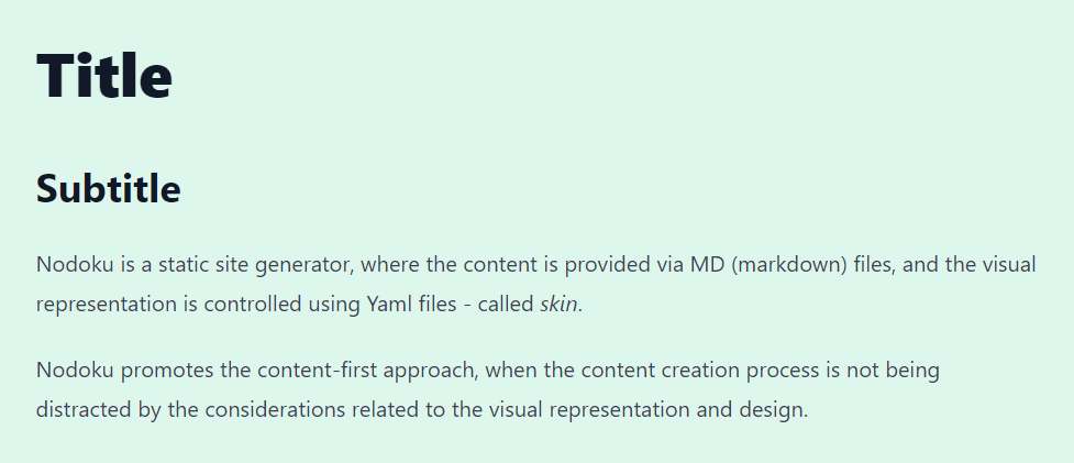
# Title

## Subtitle

Nodoku is a static site generator, where the content is provided via MD (markdown) files, and the visual representation is controlled using Yaml files - called _skin_.

Nodoku promotes the content-first approach, when the content creation process is not being distracted by the considerations related to the visual representation and design.
The result of the rendering is as follows:

HighlightedCode - a utility function component
This utility component is used to render a piece of code. For highlighting, it uses highlight.js behind the scenes.
The component is capable of displaying a code snippet in pre-selected theme.
This is achieved thanks to the fact that predefined highlight.js theme CSS files are preprocessed, to prefix the classnames with the theme name, as follows (for agate theme):
.hljs-theme-agate code.hljs {
  padding: 3px 5px
}
For more details about this process and the rationale behind this please see the blog article: Highlight your code: scope highlight.js theme to a single component
This componet is used by the Paragraphs components to render the paragraphs that are actually code snippets (represented by NdCode data structure)
Usage
Generating prefixed themes
the script to generate the prefixed CSS themes
npm run highlight.js-prefix
Building the whole bundle
The bundle can be build as follows:
npm run dist